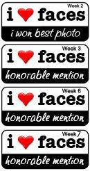
Photos By Karyn is undergoing some major web renovations, and the two year old in the house is no help when it comes to devoting time to the computer. Please pardon the mess as a variety of new logo ideas and web layouts change the appearance of my website from time to time over the coming weeks. The camera, I know how to use, the web design software, not so much! Bare with me and hopefully in the end I will find the polished and professional look I am after. All critiques welcome by the way, feel free to let me know if something looks terrible on your browser! Thanks!


1 comments:
I like the white background and the reddish font color. Very easy to read, at least on my monitor. Can't wait to see what you come up with for your header with the new logo incorporated.
Post a Comment